Redesigning the cart experience
I was a full stack product designer at Beerwulf. I was responsible for both the UX/UI product. Beerwulf is an e-commerce business, so one of the key projects I was involved with was improving the cart and checkout experience.
Role
UX/UI Designer
Project goal
Effectively communicate the user’s cart contents and to inform them of any incurred shipping costs or discounts.
Methods
User research, Wireframing, A/B testing
Year
2018
About the company
Beerwulf is an online web shop that delivers premium craft beer directly to your home. In working alongside local craft brewers, Beerwulf’s mission was to gather together beer brewers and enthusiasts to become the biggest retailers of craft and draft beers in Europe.
The problem
The company quickly expanded their product portfolios from beer cans and bottles to offering a home bar system including draught systems, refillable kegs, and beer accessories. This growth meant that changes needed to be made in the cart experience so that users can be properly informed on the shipping costs and have a clear overview of the products in the cart.
The approach
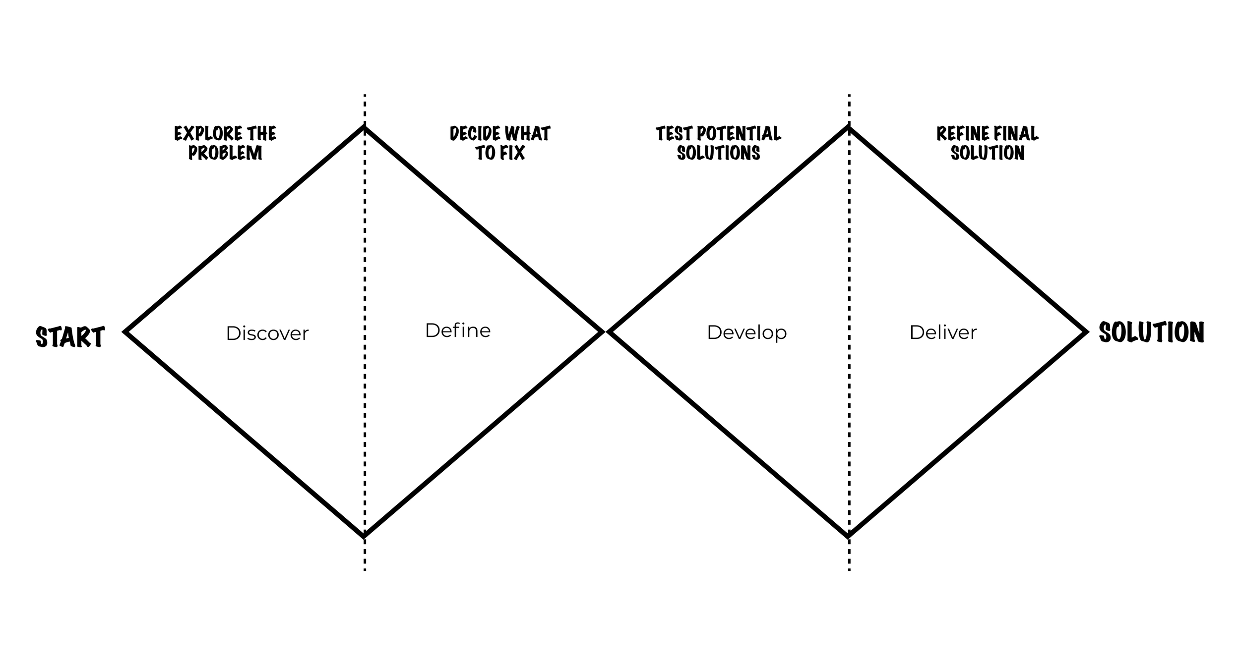
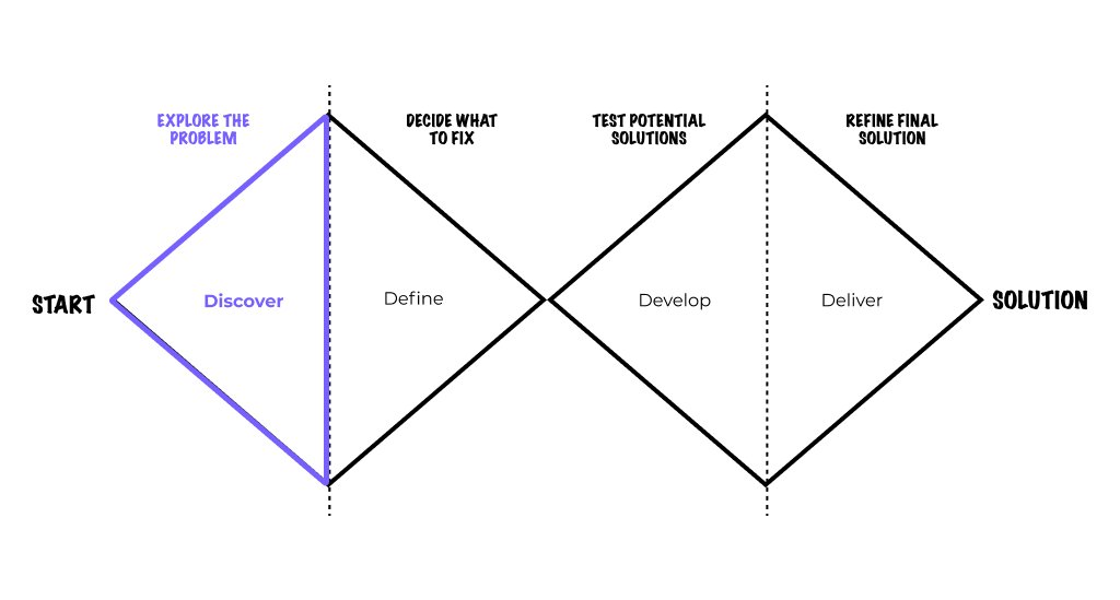
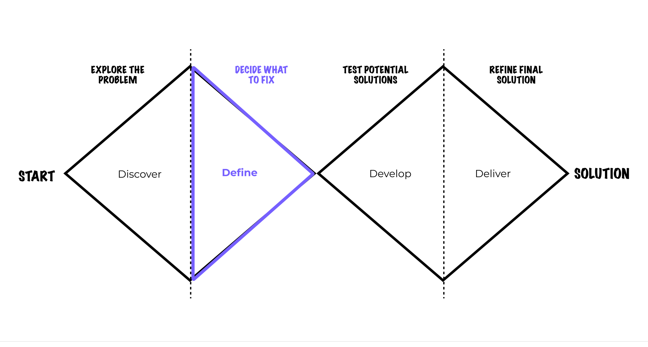
Using the double-diamond design process to improve the cart and checkout experience, my starting point was to spend time in the discover and define phase of the process. I needed to properly map out the problems, the use cases, and the persona's so I can build a good foundation of how to design a solution. I started with brainstorming a few “How might we” statements to correct frame the problem we wanted to solve.
How might we…
Simplify the cart experience and better explain complex shipping policies?
What devices are our users shopping with?
By understanding what devices our customers use, helped to inform design considerations. For example, the environment in which a mobile user shops is very different than a desktop shopper. Often times, mobile users are on the go, need access to quick info and CTAs with little time to browse and compare. In comparison, desktop shoppers often have more time to browse and search for different types of products, and are often more exploratory in their search.
Together with the other user researchers, and our power BI experts, we were able to see the current behaviour of how customers currently go through the checkout process. We discovered that 80% of our customers were mobile users, most customers bought a mix of individual beer bottles and kegs, and that most customers would fill the cart to get the free shipping incentive.
Devices breakdown
Audit existing content
Once we got a better idea on how the user was shopping on our site, we could hone in on the mobile cart and checkout experience to focus where we need to do the redesign work. I took a look at the current design to better understand what design elements we needed to keep, iterate, and toss. I collated feedback from other colleagues in different departments to also understand different perspectives on the importance of each of the elements.
How might we…
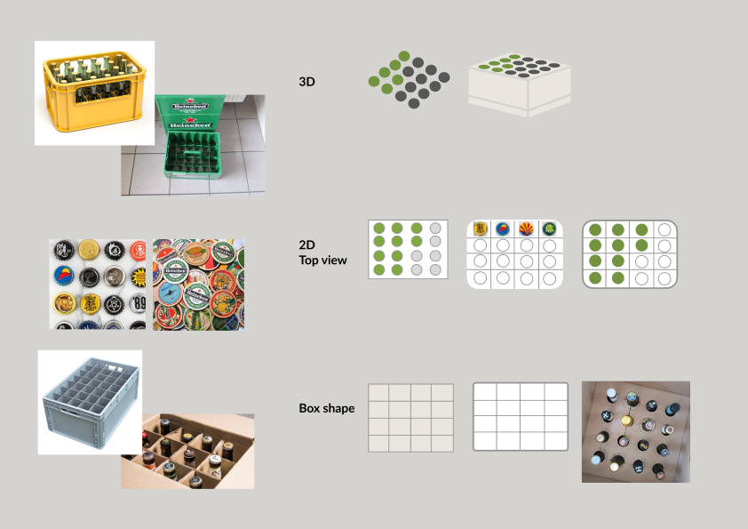
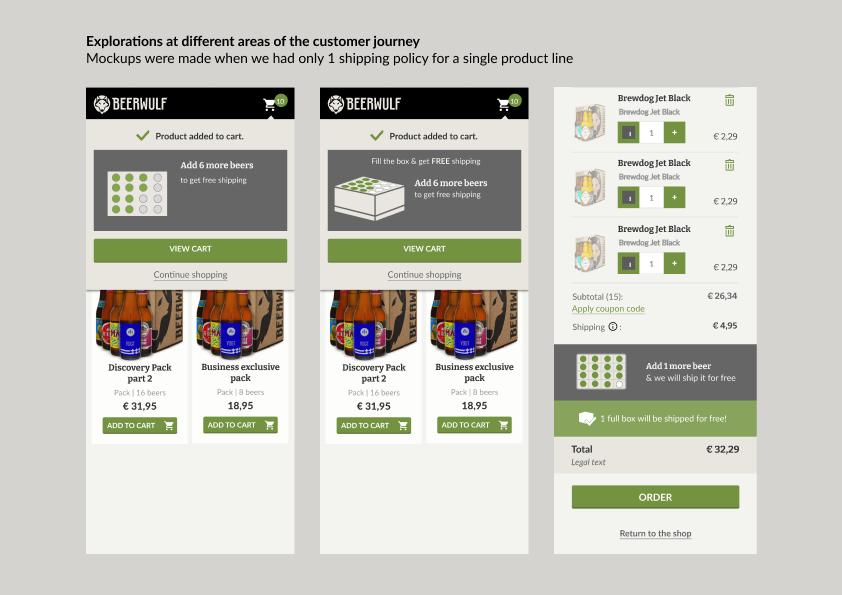
Encourage users to fill their box to obtain free shipping?
What are the shipping policies?
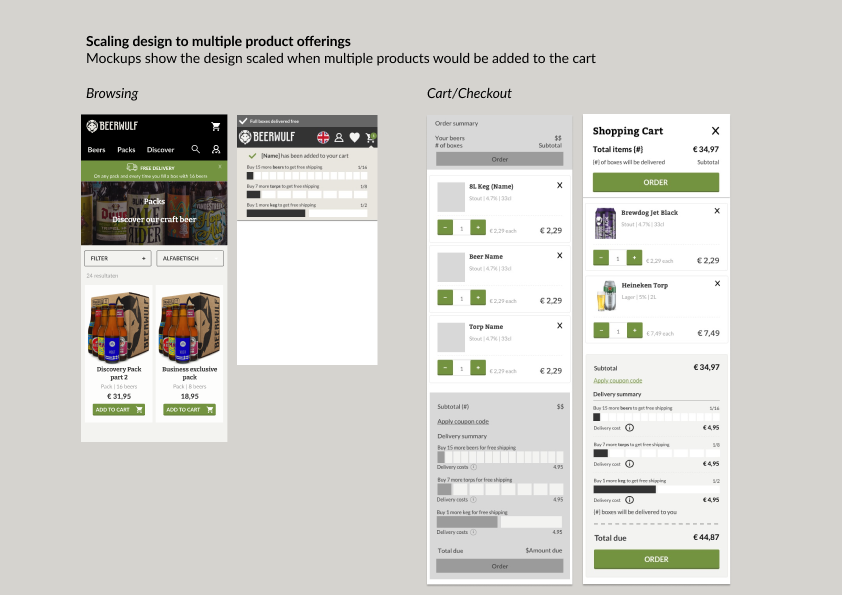
The company expanded their product offerings which required different shipping policies based on the product. It was important for us to have clarity around what the shipping constraints and if there were any other cost savings or discounts that we needed to communicate at the browsing and purchasing phase of the customer journey.
Policy to obtain free shipping
Design explorations
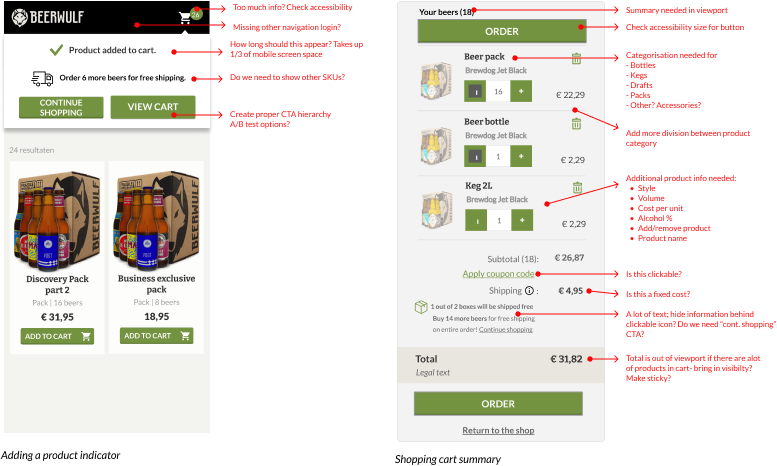
Below are examples of how the design progressed showing how to future-proof and account for multiple products to be showcased in the add to cart expierence.

